Pretty vs. Profitable: The Battle of eCommerce Design
Here's a story we've seen play out more than a few times -- a client invests thousands of dollars into a trendy, creative, and visually stunning website redesign. But after the launch… the conversion rate drops.
So, what gives? Where did the client go wrong?
This scenario poses an essential question: is it enough for your website to wow with branding alone, or should web design prioritize driving conversions and revenue above all else?
Why CRO-Focused Design Is Important
After working with a wide range of eCommerce stores—across Shopify Plus, Magento, and BigCommerce, and in industries ranging from beauty to food & beverage to home goods—we think the answer is clear. Design that focuses on conversion rate optimization (CRO) is far more valuable than aesthetics. A website that looks great but fails to generate sales is not serving its purpose.
That's not to say a CRO focused website has to be ugly - you can have both! It's just a matter of priority and balance.
When designing an eCommerce website, the goal should always be to create a conversion machine that encourages visitors to take action and make a purchase. This requires careful attention to every aspect of the website, from the site architecture and navigation to optimizing the product descriptions and checkout process.
So what should you do if you find your website leans too heavily on the aesthetics side, without much consideration on conversion? Don't worry—it happens to the best of us. Here are seven expert tips to help your site balance aesthetics with performance:
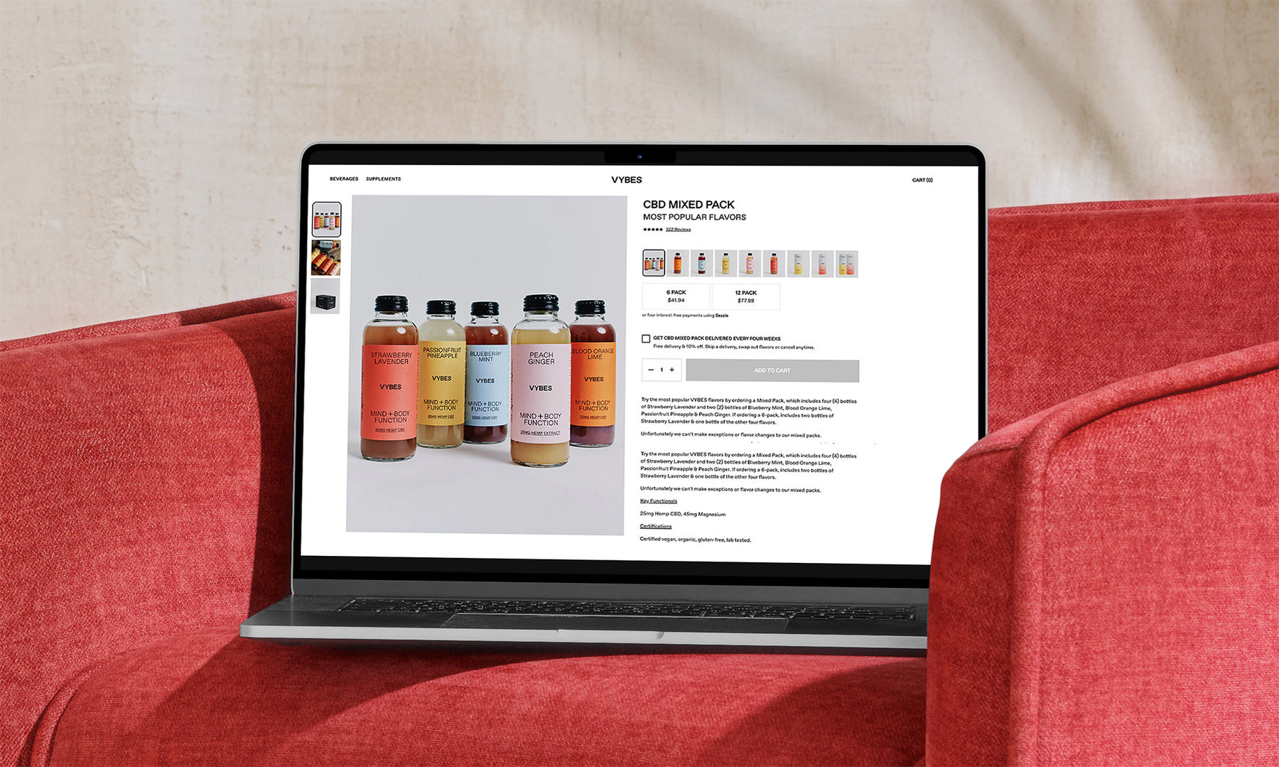
1. Focus on the Buy Box
Ensure the product page design is clean and simple to use, with all relevant information:
- Product Name
- Price
- Variant Selectors (displayed as boxes not dropdowns)
- Review summary
- Brand or Product Guarantees
Most importantly, get that Add to Cart button as high on the page as possible. Utilize the space just below to answer key transactional questions about shipping, returns, and what's included. This is also a great place to cross-merchandise complementary products and increase AOV!
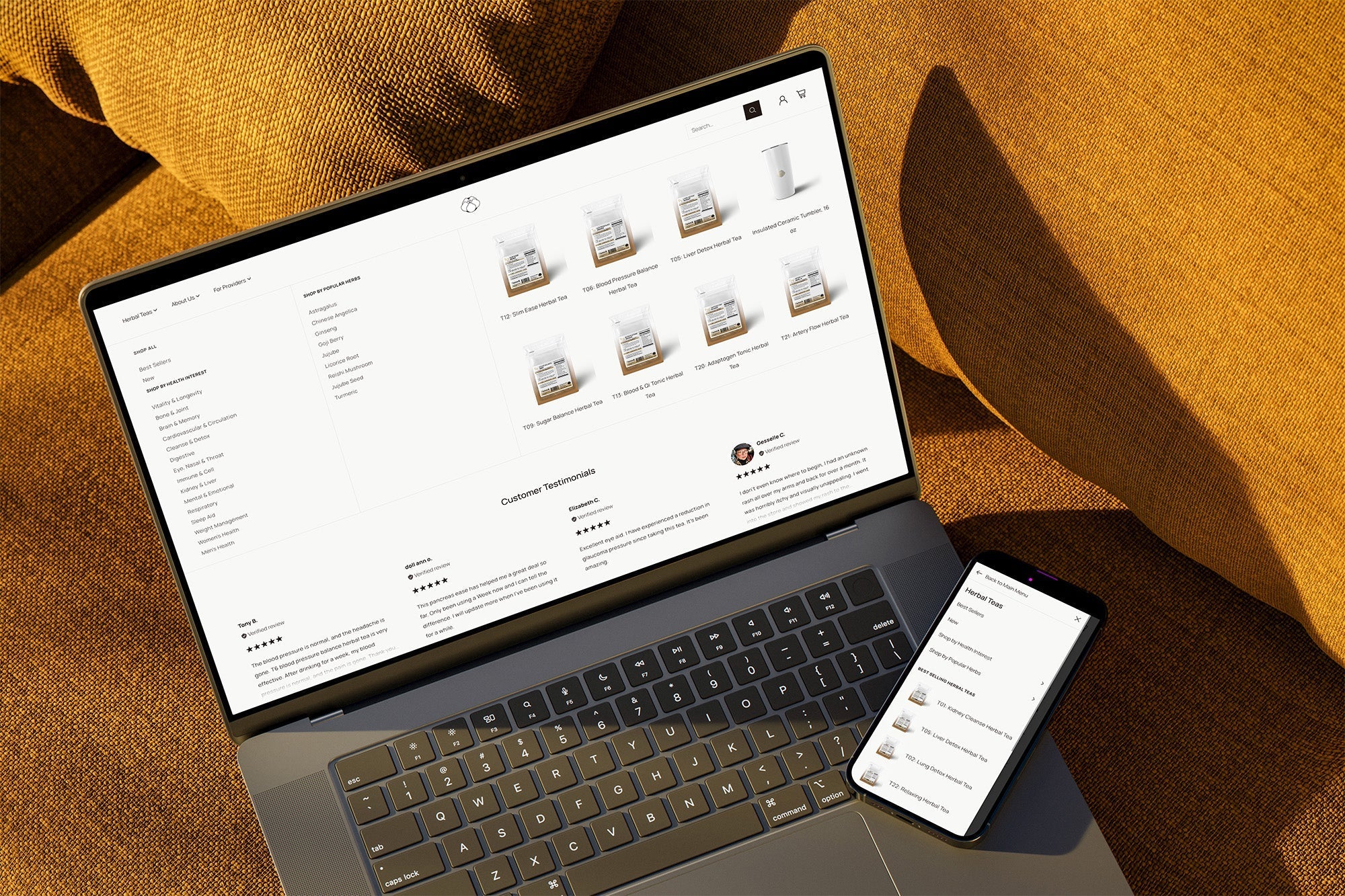
2. Images, images, images
You can never have too many high-quality product images. Visitors tend to scroll through multiple (or all) images when considering a purchase, so make sure your visuals shine.
According to the Baymard Institute, 61% of customers abandon purchases due to a lack of images or poor-quality ones. Here's how to step up your image game:
- Use high-resolution photos that show your product from every angle.
- Enable zoom functionality and thumbnails (especially for mobile users).
- Include videos in your gallery—they're highly engaging.
- Incorporate text overlays in images to highlight key product features (just make sure the font is readable on all devices).
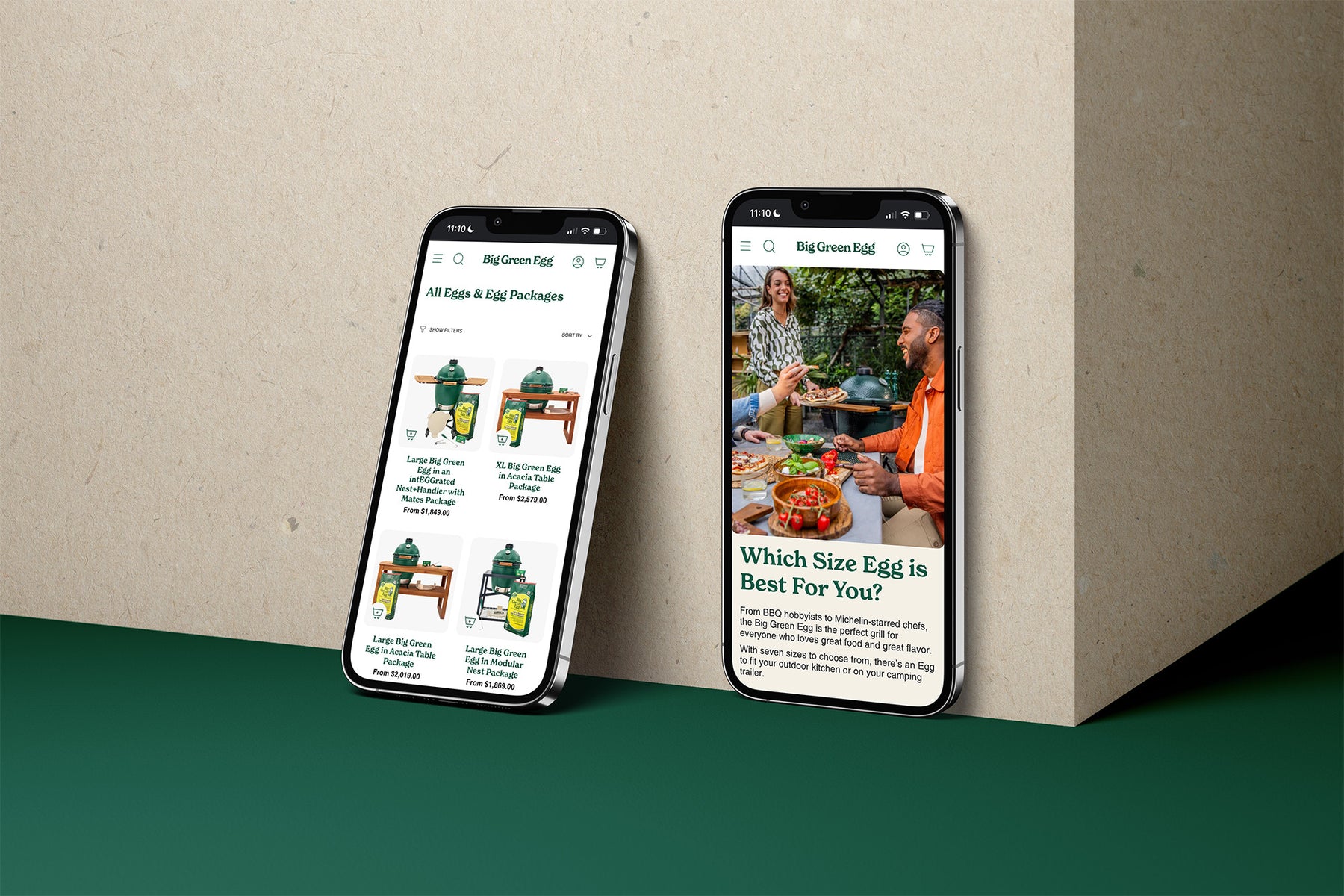
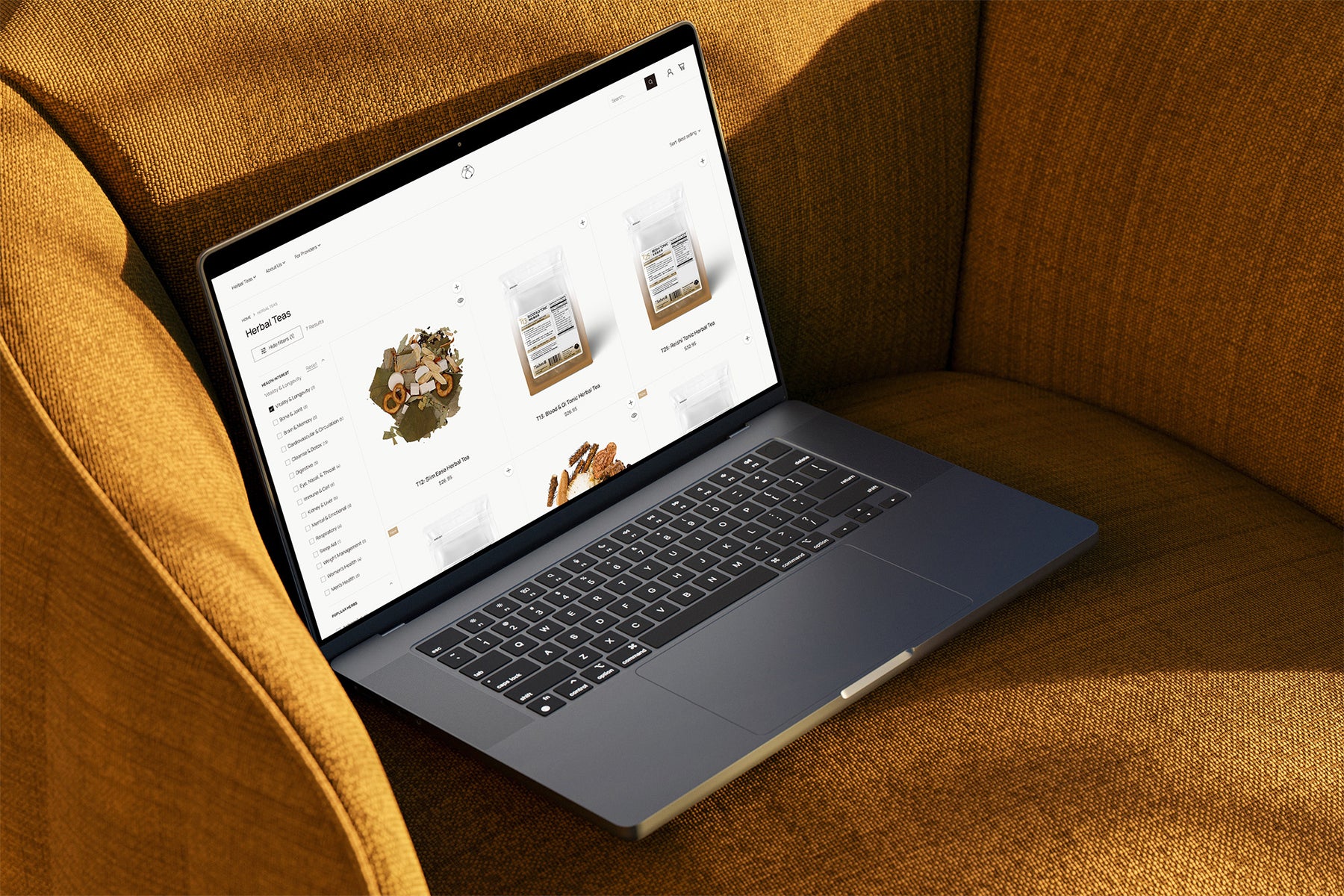
3. Streamline Your Navigation
Make your navigation a no-brainer. This should be like a sign on the highway for your customer, easy to understand at a glance.
- Expose the Shop: Display product categories in the main navigation instead of hiding them under generic labels like "Shop."
- Reduce the Clicks: For mobile and tablet users especially, design with fewer clicks in mind—think simple, intuitive pathways.
- Standard Placement: Common eCommerce navigation elements, like the cart icon in the top right and logo in the top left, should always be in expected locations to minimize friction.
- Simplified Language: Use straightforward, functional language that's easy to understand at a glance—save the clever copy for product descriptions.
4. Leverage Reviews—Even the 1-Star Ones
Sure, review widgets aren't usually beautiful, and it can be nerve-wracking to give up control over the information shared on your website. But a lot of online shoppers won't make a purchase without reading some reviews they deem trustworthy. Many go straight to the 1-star reviews to help remove their doubts.
- Sort & Filter: Give users tools to sort and filter reviews
- Reply to 1-Star Reviews: Acknowledge the negative feedback while offering help to fix the issue. This way you're creating some trust with your most skeptical shoppers.
- Spotlight the 5-Star Reviews: Your 5-star reviewers will rave about your products in a way that you can't.
5. Provide Clear Shipping and Return Information
Customers want to know what to expect when it comes to shipping and returns. The Baymard Institute found that 24% of customers abandon their carts due to unclear or complicated shipping and return policies. Make sure to provide clear and transparent information about shipping costs, delivery times, and return policies. Don't let your customers be surprised by hidden costs - utilize a free shipping threshold or flat rate shipping costs that you display in the cart so the first time they're seeing this cost isn't at checkout.
6. Optimize Site Speed & Core Web Vitals
Ensuring a fast-loading, responsive, and visually stable website is essential for providing a positive user experience. Shoppers are more likely to abandon a site with slow-loading pages or erratic content, resulting in lost sales and a negative brand image. We recommend removing scroll animations and fancy effects that slow your site down. This isn't to say you can't have some creative elements - just assess the overall impact.
7. Simplify Your Content
We occasionally come across design-led websites with flashy headlines or copy that feels creative at the expense of clarity. But site visitors aren't there to admire your prose; they're looking for information to make a purchase decision. We recommend using our CCCC framework:
- Clear: Explain product benefits in simple language.
- Concise: Keep sentences short and to the point.
- Customer-focused: Center your content around how the product solves their problems.
- Conversion-driven: Make sure your content helps move users toward taking action.
Key Takeaways For Your Store
If it's been a while since you revisited your site's design with a focus on conversion rate, here are the three things you should prioritize:
- Simple site architecture and site navigation - make it easy to find the right product and check out.
- Great product imagery - invest in high-quality product images, lifestyle photos and video to showcase your products.
- Optimize your buy box - most ecommerce conversions happen here, so make sure it's compelling, informative, and easy to use.
By balancing aesthetics with conversion rate optimization, your ecommerce site can not only look good but also drive more sales and grow your business.
Read Next

Big Green Egg Launches on Shopify Plus
We're thrilled to announce the site launch of Audio Advice's new Shopify Plus site on Tuesday, October 1, 2024! ...
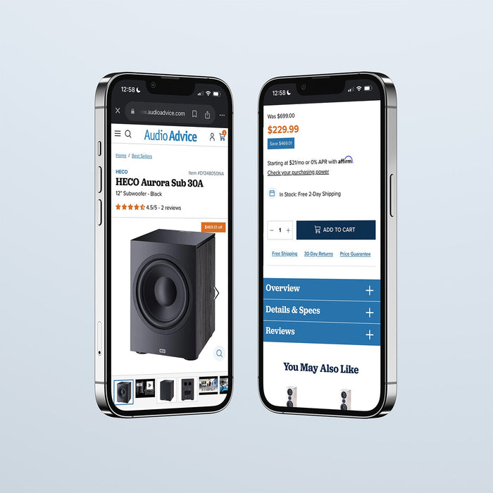
Audio Advice Launches on Shopify Plus
We're thrilled to announce the site launch of Audio Advice's new Shopify Plus site on Tuesday, October 1, 2024! ...
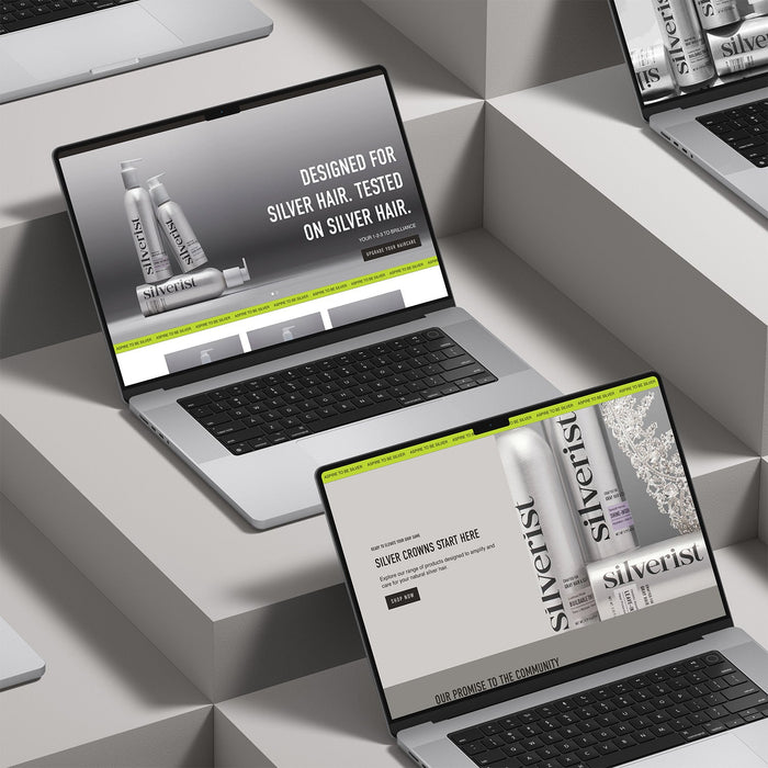
Silverist Launches on Shopify
While we aren't always proud of our puns, we couldn't be more excited to share the site launch of Old California's new BigCommerce site on...